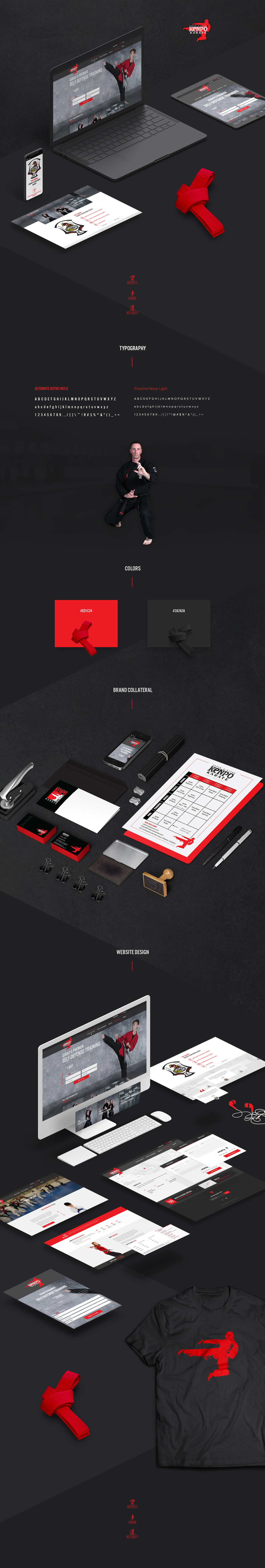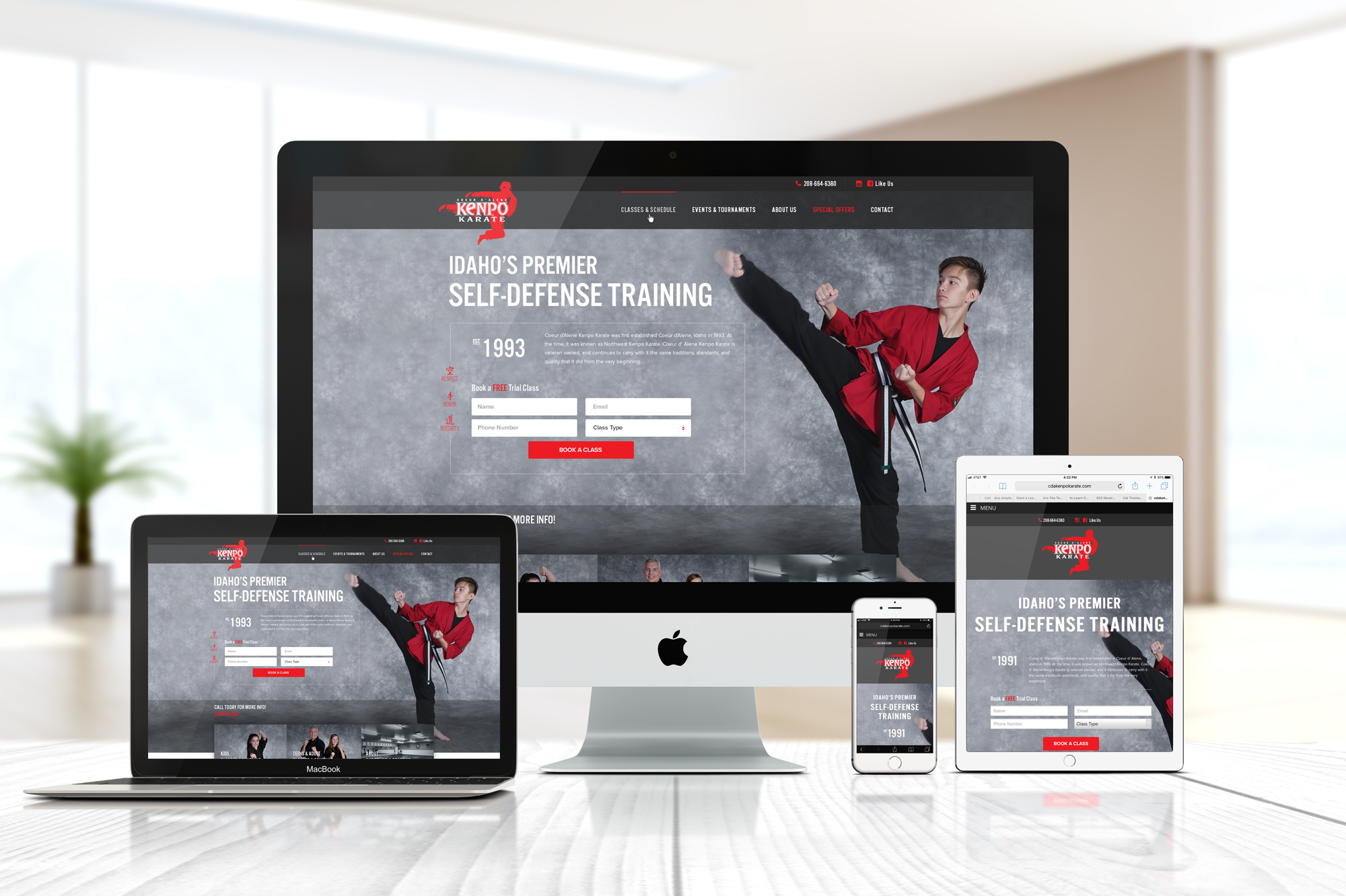
The Kenpo Karate studio in Coeur d’Alene, Idaho, needed a brand that showcased their values of confidence, discipline, and fitness. They struggled to convey their mission and attract new members with a cohesive brand and visual identity using their colors of red, black, and white.
We delved into their philosophy and audience to create a logo and brand identity that reflected Kenpo Karate's essence. Integrating their vibrant color scheme, we ensured all materials communicated the studio's ethos. We then developed a user-friendly website and designed marketing materials to complement this online presence, all while maintaining visual consistency.

Our efforts delivered a unified brand experience for the Kenpo Karate studio, with a striking logo and website that embody their core values. This branding, alongside cohesive marketing materials, effectively enhances the studio's visibility and positions them as a premier martial arts provider in Coeur d’Alene, fostering community growth and personal development.