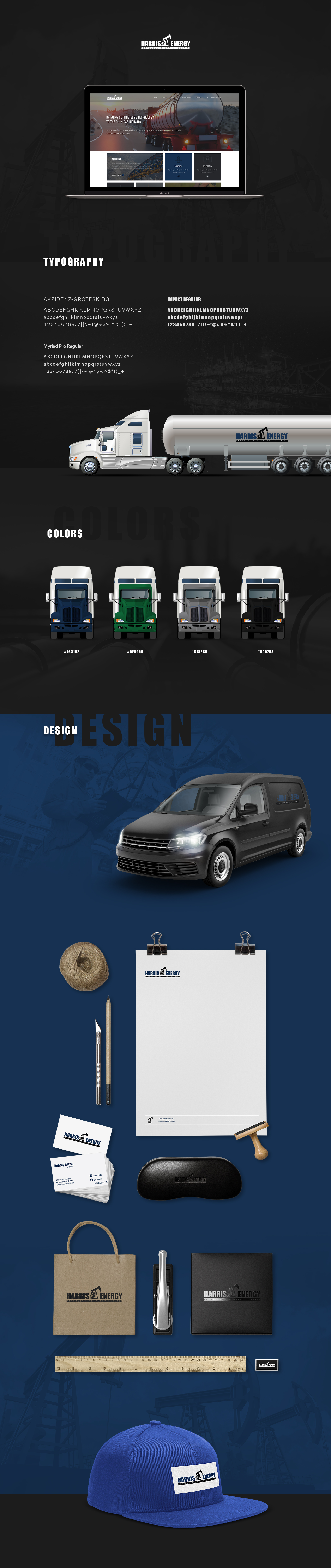
Harris Energy, an oil recycling company, needed to boost its brand to reflect its focus on sustainability and advanced recycling. They sought a branding overhaul to better match their environmental goals, including updating their logo, creating a unified identity system, and designing new business cards and marketing materials.
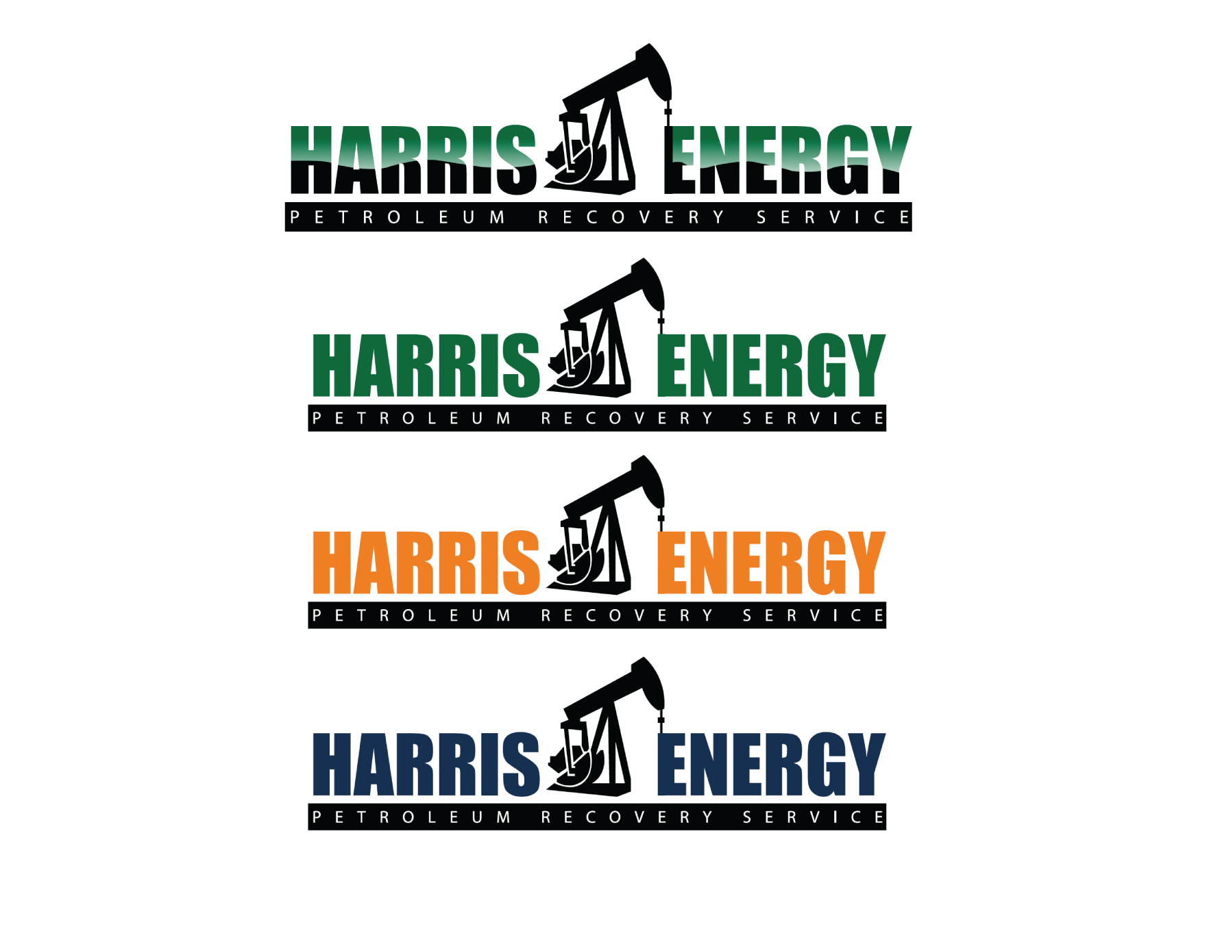
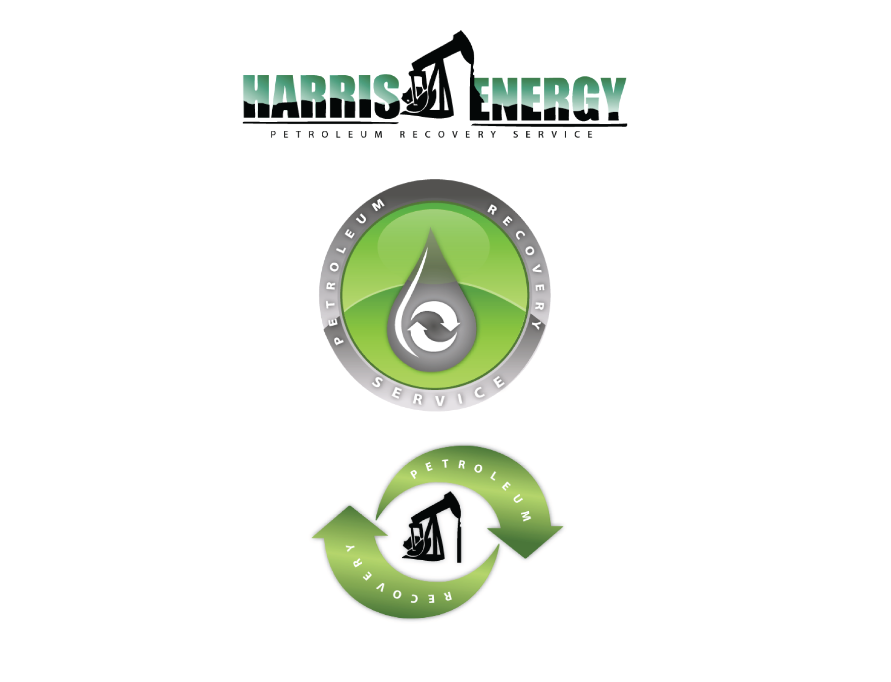
We analyzed Harris Energy's mission and audience to redesign their logo, choosing colors that symbolize recycling and sustainability. Our goal was to ensure the new brand identity communicated their commitment to the environment consistently across all platforms and materials.
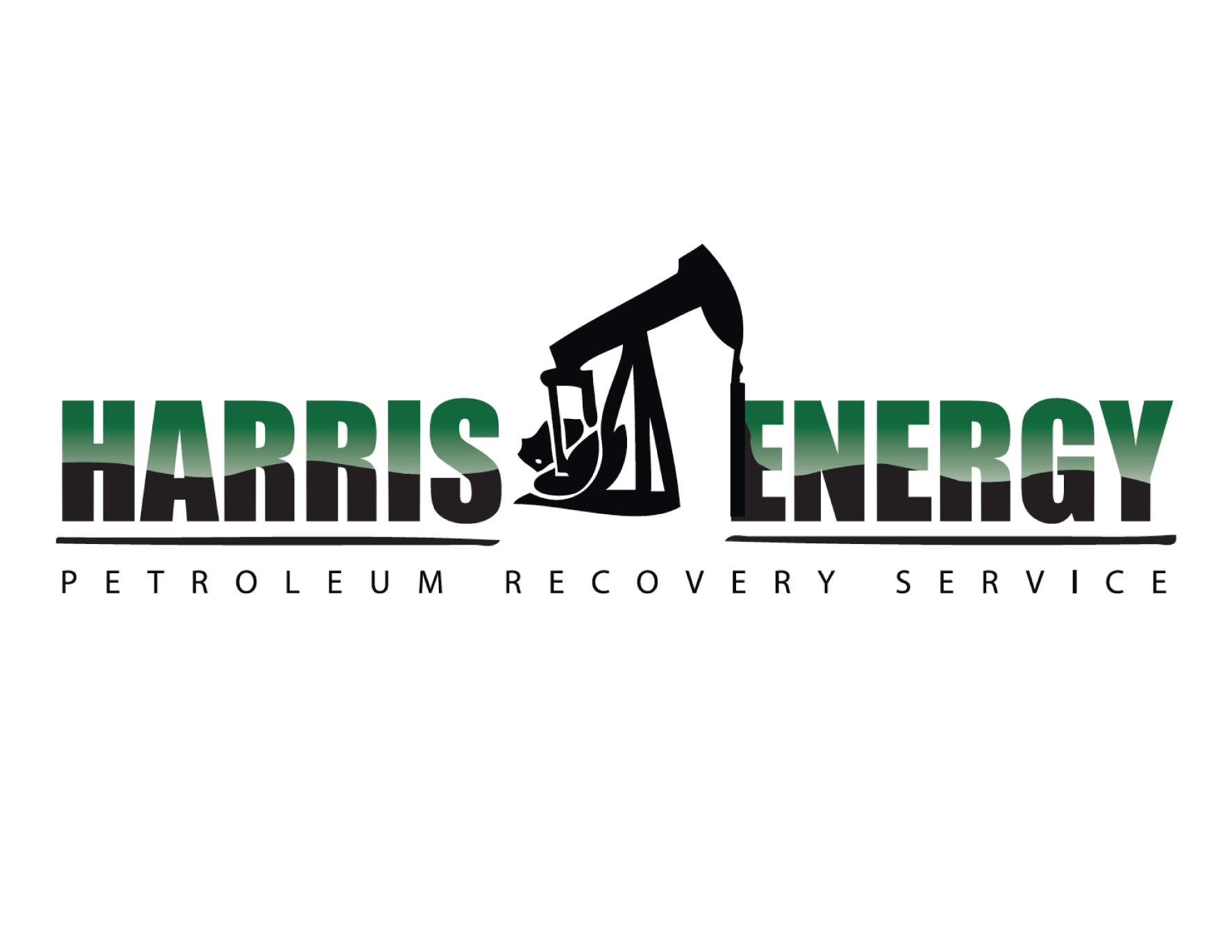
We developed a fresh, modern brand identity for Harris Energy, featuring a logo and design that align with their sustainability efforts. This new branding, applied to business cards and marketing materials, enhances their visibility and clearly conveys their dedication to innovative recycling solutions, positioning Harris Energy as a leader in the eco-friendly market.