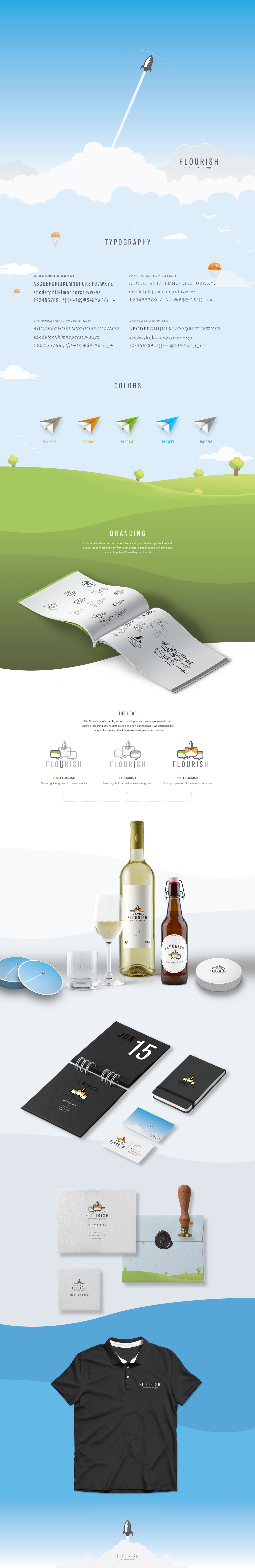
Flourish aimed to create a brand identity reflecting their mission of community growth and collaboration but faced the challenge of lacking a visual identity that captured their essence. They needed a logo, identity system, and business cards that embodied their commitment to reaching new heights and fostering partnerships, with compensation through exposure, not payment.
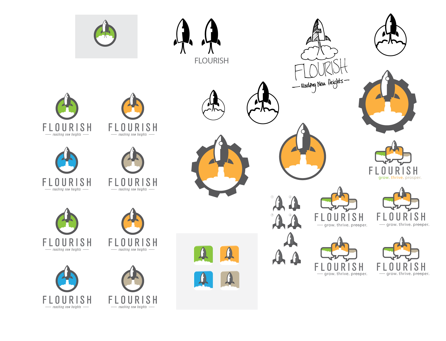
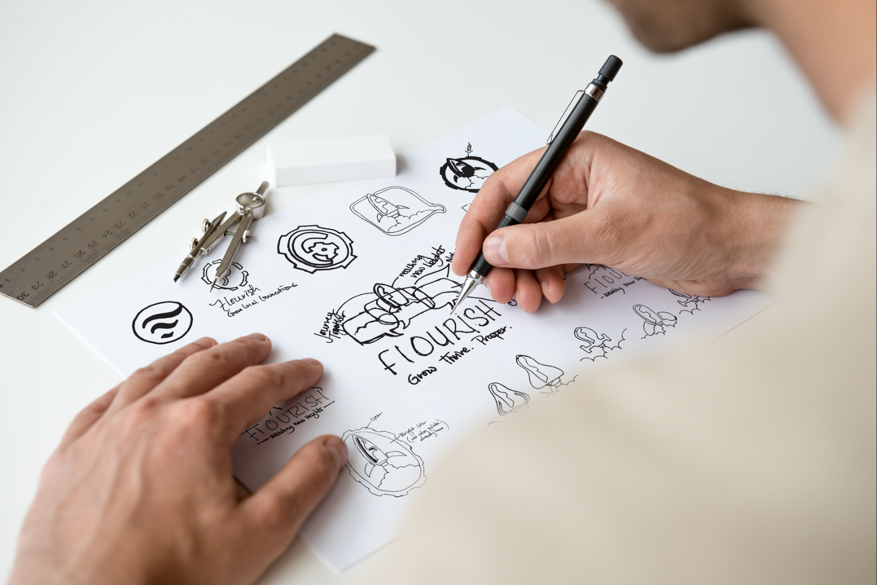
We started by brainstorming a name and settled on "Flourish" to signify growth and success. Designing a logo with a rocket symbolized their goals of advancement and building relationships. Our focus was on developing a recognizable brand image and business cards that effectively represented Flourish's values and aspirations.
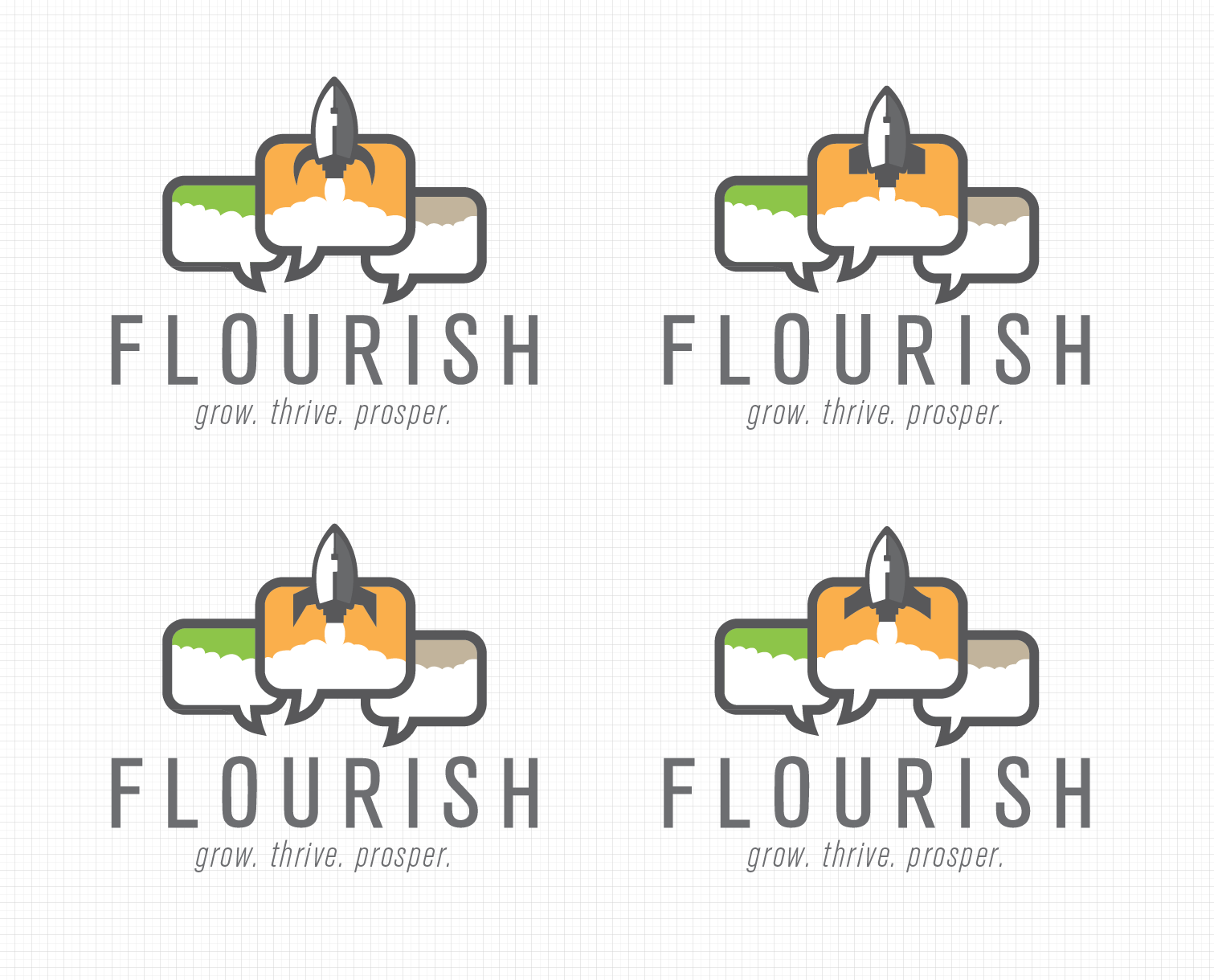
The result was a dynamic brand identity for Flourish, featuring a rocket logo that symbolizes their dedication to growth and partnership. This branding, alongside unique business cards, establishes a consistent image across all touchpoints, inviting engagement and collaboration. This project not only enhanced Flourish's brand presence but also increased our visibility through a unique compensation model, showcasing our creative branding capabilities.