


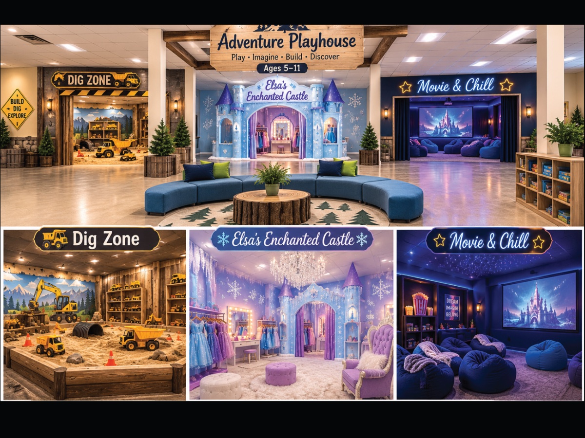
John Delbridge first approached us for wall graphics to bring the themed play zones of his new children’s drop and play center to life. Originally called The Adventure Club, the concept needed more than colorful, playful walls. It needed a unique name and brand identity that would capture kids’ imaginations, appeal to parents, and stand out from other drop and play centers.
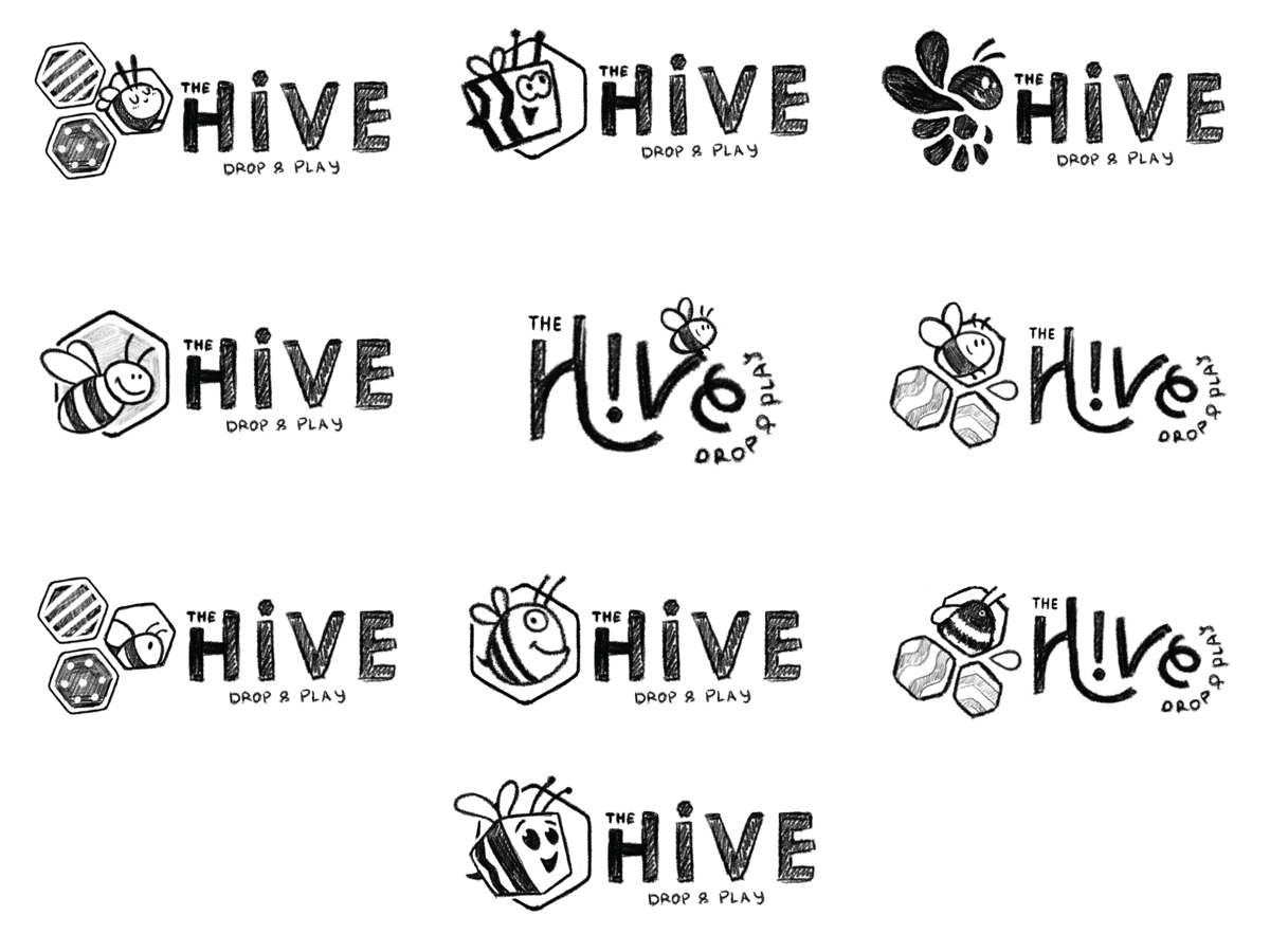
We started by developing five distinct naming and branding concepts, each with its own personality, theme, and creative direction. John and his team selected The Hive, giving us a playful foundation to build on. From there, we explore multiple logo concepts, experimented with friendly bee characters, honeycomb shapes, custom lettering, and color combinations to create an identity that felt fun, memorable, and original.
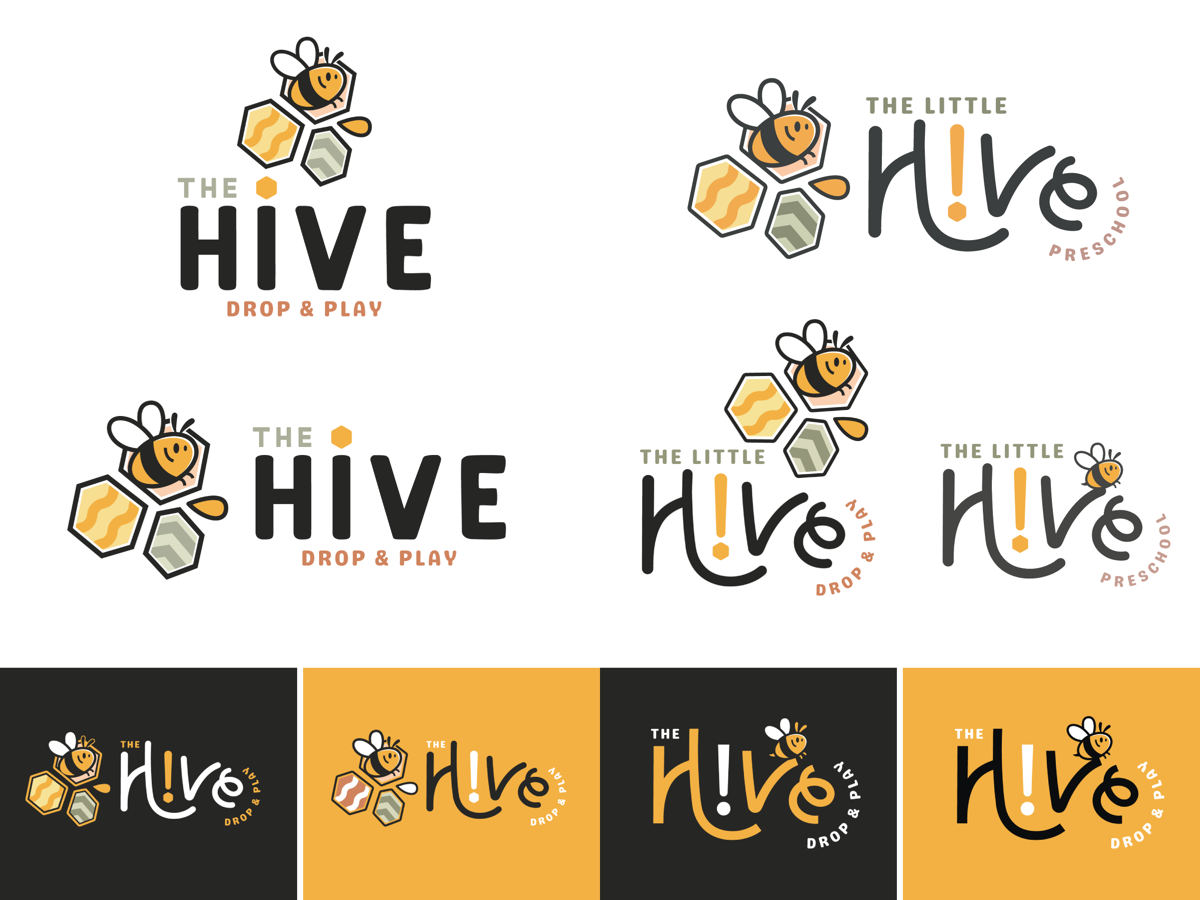
The Hive became much more than a name. We developed an entire brand experience around it, with birthday parties called “Swarms,” staff known as “Hive Keepers,” and a cafe named “The Honeycomb.” Paired with a cheerful bee mascot, honeycomb graphics, playful typography, and warm colors, we created a distinct identity with its own personality, language, and endless opportunities to bring the brand to life.



